Analysis of Website Design
25th of June 2014
In my opinion, three things have to be fulfilled in order to have a well designed website:- The design has to fit the purpose of the product
- The design has to fit the purpose of the product
- The design has to fit the purpose of the product
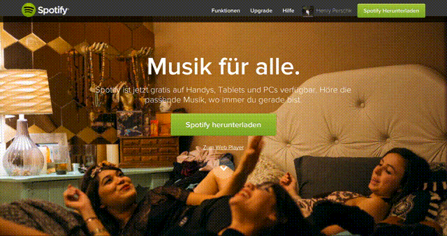
For me 'minimalistic' is not equal to little content. I think this really depends on the purpose of the product (or website in this case). That's why I chose the spotify.com/de website as one of my three examples for nice design. [I don't know whether the american version looks the same]. You can have a look at it by clicking the jump-link 'Design of Spotify' in the sidebar. The site is minimalistic, but it still offers rich content. It invites the user to come and discover new things. I really like how new images show up when you scroll down. So this website perfectly fits its purpose 'discover' (and 'sell' eventually).
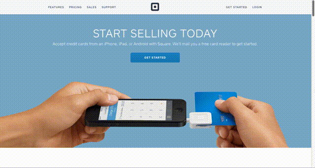
In contrast to that the 'Square' website squareup.com has - besides the selling purpose - the purpose of priming the user, so that he/she can get started right away. The emphasis is not so much on discovering 'the world of Square' (like you do on Spotify). It has very good pictures, a 'How to' section and is all about getting started quickly. Also the contrasts of the colors are very nice.
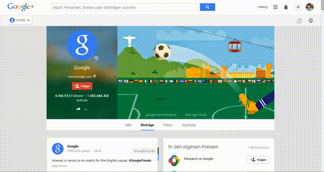
Now, for me, Google+ is like a mixture of the two designs above. That is no surprise, because the Google products are all well designed, so that they fit their purpose. And what is the purpose of Google+? Right, a mixture of 'discover' and 'inform'. That is exactly the quintessence of a social network. So the design meets the requirements to be considered as an informative site - it's clean and it's not full of fancy colors. But also, the user generated content fills the site with life and invites to discover more.
All of the sites follow a specific design scheme that is predominant at the moment, I think:
- A header line that contains the main navigation items of the website. It follows when you scroll.
- A content part that either uses mostly dark or mostly bright colors. A good contrast is important.
- Images and videos in high resolution that fill out the whole screen width.
- A footer that contains more navigation items like 'About Us' and such.
- A consistent usage of fonts and font sizes/styles, that don't alter from page to page.
- Big font size, not too much text. A picture paints a thousands words.
- Not too many subpages, so that the user doesn't get lost.
- If it's a web app, dynamically loading content. Some web apps do that seamlessly.
Spotify (German Website)
Square
Google Plus