Wireframing
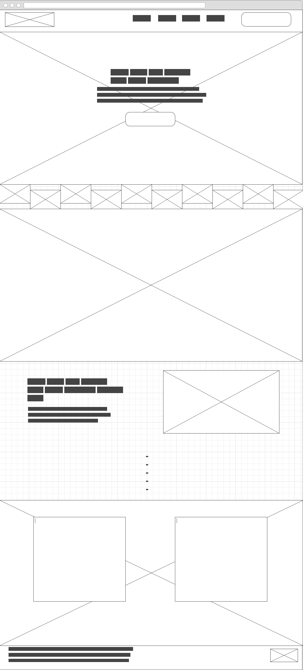
Spotify
The website aims to abduct the user into the world of Spotify. It's not just a simple "click here to download website". Spotify's visual challenge is to create the positive feelings that music brings to the users mind. They achieve this goal by placing large pictures that show real world situations and express specific emotions.

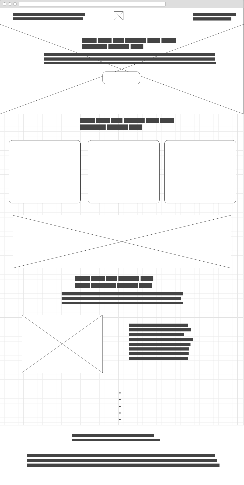
Square
This website is created under the premise to inform the user about their product, and selling it eventually. Their visual challenge is to make clear how the product works immediately. They do this by placing one meaningful picture at the top. After that short, precise descriptive textboxes follow, using big fonts. Strong contrasts are applied.

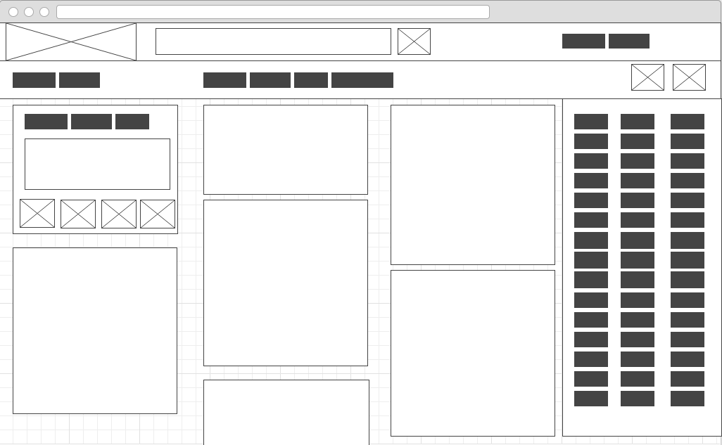
Google Plus
Google+ is a social network. Social networks usually contain a lot of user generated content. Since it has a large userbase, there's also much content that contains images, videos, texts, GIFs and so on. So the visual challenge here is to organize the content in a way that it doesn't look overwhelming. Google did a good job here by using not many colors and providing good structure.
